Monday, November 14, 2011

Final Project ideas

For this project i'm not quite sure what I wanna do...it has to incorporate alternate printing techniques which has a huge field of possibilities. I have some ideas, but at this point I haven't had the chance to experiment with anything, since it has to deal with the printing process and not necessarily the subject process. I was thinking about keeping the same photos from the first project, the ones of Point Lookout with vaseline smeared on the lens, but printing them in a different way.


One technique that I saw was printing on cloth, which i think could be a really neat way to print, but might also be a bit expensive depending on the process and cloth needed for the work.


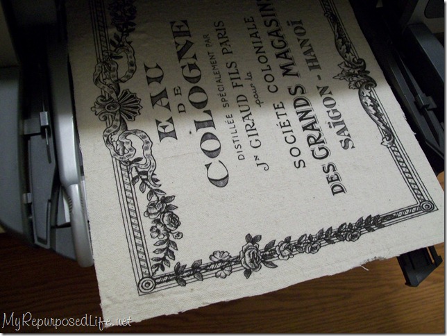
One thing though is that the process of printing on fabric seems a bit daunting..it sounds kind of hard but probably would be easy after doing it once... "If you search on the web you’ll find a number of sites that tell how to do this on small, dye-based inkjet printers. The instructions generally run: either soak the fabric with a product called Bubblejet Set, or a home-made recipe of soda wash and fabric softener (this is to remove the sizing and prepare the material to accept the dye ink); hang to dry; iron onto freezer paper (the freezer paper supports the fabric as it goes through the printer and will easily release the fabric after printing); rinse the printed fabric in water with fabric softener to set the dye, then hang to dry." (reality tourist.wordpress.net)


Another option that i was thinking of was printing on canvas. I know this isn't anything new but I've always wanted to print on a material that really makes photos look professional and neat. With my subject matter i think it would work great. I'd also like to print bigger if i choose this option, probably a bit bigger than 11X14, since i've already tried experimenting with that size. Printing on canvas doesn't seem that difficult, but it sounds like i'd have to send it out if i don't have the right materials. I'm still looking up information on the process but this is one of my better options.


One last option is to try printing on glass. I've always wanted to incorporate Sally Mann's wet plate collodian printing but since getting some of the materials is rather hard to get (ether, etc) I wanted to try and incorporate other ways of printing on glass. I could use the technique that was shown to us in class which I honestly want to use as a fail-safe so I don't have to print anything out on the printer first...but if I can't find any other technique i'll just stick with that.


Out of all of the techniques I think i want to stick with printing on fabric first, then canvas, then glass. Depending on the difficulty level hopefully one of these options proves to be a new and exciting way for me to print my art.

Thursday, November 3, 2011

More objects for zombie game

Here are more updates on the objects that i've been creating for the game..


A computer chair:


Counter:


dryer:


bait:


There are more objects but my partner is creating some as well :)

Game design update

This project is really starting to come along as far as the designing aspects go. The only thing that really sucks is the communication between teams. I wish that we had an entire semester to do a project like this so that I could add a limitless amount of detail, but I think that since the game is 8bit anyway, detail isn’t too important of a factor. The game designers said that they liked the characters, but that they would like to see a military type person, a scientist and a regular character. I had already created a regular looking guy character so I decided to get working on the military and scientist characters. Here are the sketches for what they look like:


Scientist:


Military guy:


And this is what they look like after they are colored!


Now all I need to do is create the characters in different poses (I’ve already done this step) then add a hot pink layer to the background so that it acts as a transparency for the objects and characters.

This is an example of what they all will look like before sending them off.


As well as each character I had to design some of the objects in the game as well. This includes random objects like a t.v, bush, a computer, etc. Although, I’m finding it harder to create objects that resemble the same sort of style as my characters do. I’m adding the black outline to objects but it doesn’t necessarily fit like it does with the characters.


The final results should look really well and then I will send each object as a single file to the team (this is already done too!) ☺

Artist inspiration-Aaron Garbut


Although I didn’t necessarily look towards any artist for inspiration in creating the videogame art for this project, the artist that I found to be the most influential for this was Aaron Garbut and his work on the Grand Theft Auto videogames. Garbut is a videogame artist and the artist director at the company Rockstar North. Although he is most famous for his work on the Grand Theft Auto series Garbut has done other work on the videogames “Manhunt” and “Tanktics.” He started doing work ever since the first GTA game came out in 1997 and has since been working on the series for this game, with the latest being “Grand Theft Auto: Episodes From Liberty City.”


Even though my artwork for this videogame project honestly looks nothing like Garbut’s, I really liked the way he actually went through his process of being an art director for the game artwork. In several interview’s he states that at the beginning of the game creation there is just a lot of random ideas, characters and other media that doesn’t necessarily fit into the final game, but that all of this is an important process in creating the final artwork for the game. This reminded me of way me and Michael felt at the beginning of this project; not knowing what kind of artwork to create and generally just having a bunch of random ideas that we hoped the game creators would like. Garbut states in an interview with CGsociety “we have a bunch of ideas, elements of the story, the characters, locations, the general tone, gameplay elements, technology, mission ideas, and we just mix it all up and see where it goes trying to steer it along the way. It's all a big scary tangled web. But it works”(cgsociety.org.)


One of the main things that attracted me towards Garbut’s artwork was his use of thick black lines around objects and characters. When I created the characters for the artwork of this game project I originally just added a thick black line around everything, not for any particular reason but just because it felt natural. In Grand Theft Auto the artwork also has a sense of light to every scene. Although I couldn’t really work with lighting too much in the game, I liked how everything in GTA had a real but almost cartoony look. Garbut help create this aspect of the artwork along it’s development more with older versions of the game. Even though he helped create this along with newer games, there was more of a focus on making everything look real in the later games and therefore the thick black line was barely used.


There is little known about Aaron Garbut but his work on the GTA games is widely recognized. Although he oversees all of the visual elements of the game creation a lot of his ideas are used in the final versions of these games. His use of thick black lines and his lighting effects are two of the main aspects of Garbut’s work that I find interesting. Also, his use of color is also used well throughout every series. Not too bold of color but enough to create an emotional response in its players. For example, even though this plays into the lighting affects as well, the dim-lit, cityscape backgrounds helps play into the main character’s actions and responses.Also, the use of a lot of solid colors is something that I wanted to apply to my artwork as well. Overall though, I love his style of game design artwork and I think that for future projects, with more time I could incorporate more of his ideas.